Sosmed Design
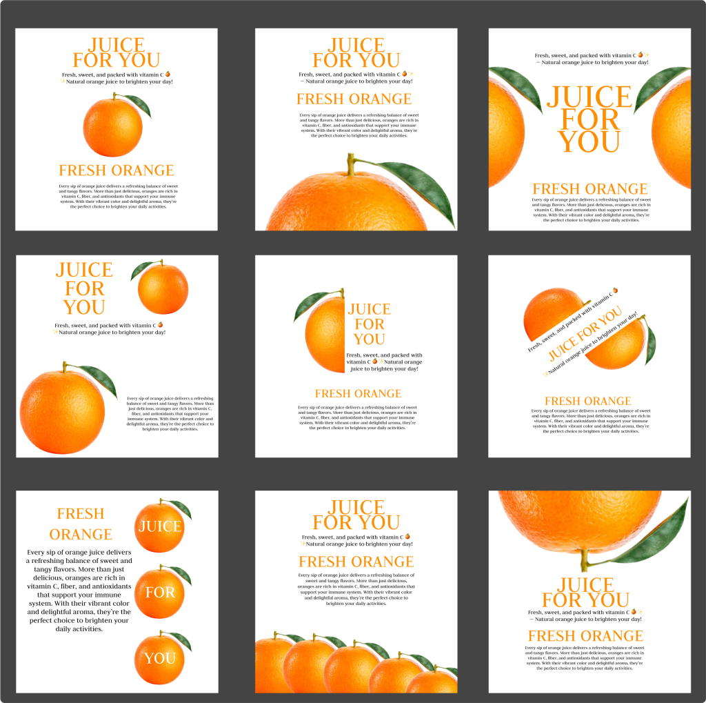
The image you uploaded contains a set of nine square promotional designs for orange juice, arranged in a 3×3 grid. Each square has a clean, minimalist white background with vivid, high-resolution images of fresh oranges—some whole, some sliced, some close-up—placed strategically in different positions. The overall theme highlights freshness, health benefits, and natural appeal.
At the top of each design, the main headline reads in bold orange uppercase letters:
“JUICE FOR YOU”
Beneath it, in smaller text, appears a short tagline such as:
“Fresh, sweet, and packed with vitamin C 🍊 — Natural orange juice to brighten your day!”
The secondary headline in each design is:
“FRESH ORANGE”
Accompanied by descriptive text like:
“Every sip of orange juice delivers a refreshing balance of sweet and tangy flavors. More than just delicious, oranges are rich in vitamin C, fiber, and antioxidants that support your immune system. With their vibrant color and delightful aroma, they’re the perfect choice to brighten your daily activities.”
The text placement varies slightly across the nine designs, with different alignments and artistic arrangements, but the key message is consistent: orange juice is natural, healthy, full of vitamin C, and refreshing for daily life.
The oranges themselves are photographed with a glossy, vibrant appearance, often accompanied by green leaves, emphasizing their natural freshness. Some layouts feature a single orange, while others show multiple oranges in a row or in creative overlapping positions.
In summary, the designs collectively promote orange juice as:
Fresh and natural
Sweet and tangy
A healthy source of vitamin C
A perfect way to energize and brighten your day
Would you like me to rewrite this description into one long continuous marketing-style text (like a product advertisement), instead of just describing the layout?